
Walk through almost any workplace and you will notice them straight away — bold shapes fixed to walls, painted stripes on floors, vivid symbols above doorways. Warning signage is so embedded in our working lives that it can be easy to overlook the sophisticated thinking behind it. Yet the colours, shapes and layouts of these signs are no accident. They draw on decades of research into human perception, behavioural psychology and visual communication to keep people safe in environments where hazards are a daily reality.
Key points
- Workplace safety signage uses colour psychology and specific shapes to trigger immediate cognitive responses and maintain hazard awareness.
- The ISO 7010 standard creates a universal visual language, where red signifies danger, yellow indicates caution, blue denotes mandatory actions, and green marks safety routes.
- Effective signs combine colour with distinct shapes—such as triangles for warnings and circles for mandatory requirements—to provide dual-coded information for faster processing.
- High-contrast visuals and clean, sans-serif typography are critical to ensuring legibility and quick information absorption in fast-paced industrial environments.
- To accommodate those with colour vision deficiencies and different cultural backgrounds, signage must rely on universal symbols and pictograms rather than colour alone.
- Strategic placement at eye level and regular maintenance are essential to transforming static signs into active tools for effective workplace risk reduction.
How Does Colour Psychology Influence Risk Perception in the Workplace?
The relationship between colour and human emotion is well established, and workplace safety signs exploit it deliberately. When we encounter a particular hue, our brains process it almost instantaneously, triggering an emotional and cognitive response before we have even read a single word. This is why colour coding safety sits at the heart of every credible signage system. The internationally recognised standard ISO 7010 assigns specific meanings to each colour, ensuring that workers across different industries and locations share the same visual vocabulary. Red communicates danger and prohibition, yellow signals caution and the presence of a hazard, blue denotes a mandatory action, and green points towards safety or emergency routes.

Why red demands immediate attention in hazardous zones
There is a reason that prohibition signs and fire safety equipment are marked in red. Psychologically, red is associated with urgency, alertness and the need to stop. It triggers a heightened state of awareness that is deeply instinctive, prompting an immediate behavioural response. In practical terms, red signs — typically featuring black pictograms on a white background within a red circle — are used for instructions such as no smoking notices and the identification of fire safety equipment. This strong visual language ensures that even in a busy, noisy environment, the message cuts through instantly.
The Role of Yellow in Communicating Caution Without Alarm
Where red commands a stop, yellow encourages alertness without triggering panic. Yellow and amber signs, shaped as triangles with black pictograms on a yellow background, are the standard for workplace hazard prevention. You will find them warning of slippery floors, high voltage equipment and other potential dangers. The triangular shape itself reinforces the warning message, as safety sign design relies on shape just as much as colour — circular signs indicate mandatory requirements, while triangles signal a caution. Together, colour and shape form a dual-coded message that the brain decodes with remarkable speed, reducing the time between seeing a sign and acting on it.
Which colour combinations maximise visibility and compliance?
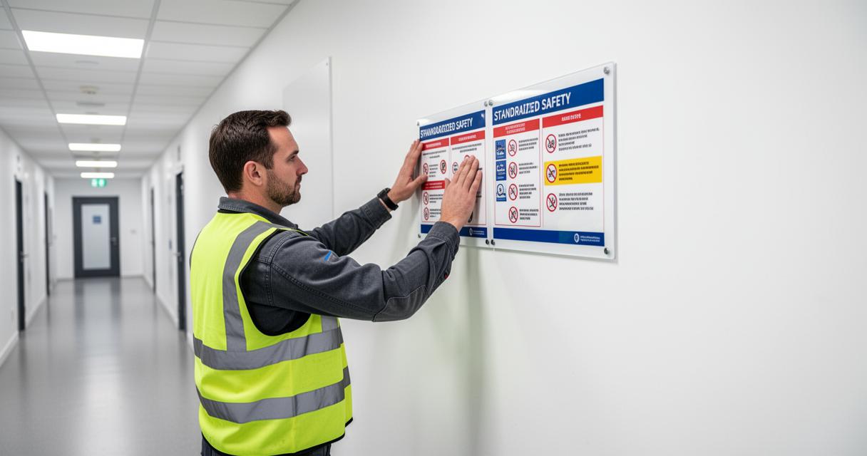
Choosing the right colour is only part of the challenge. A sign that blends into its surroundings, however well-intentioned, will fail at the critical moment. Effective visual safety communication depends on contrast, placement and consistency working in concert.
Contrast and Legibility: Pairing Colours for Maximum Impact
High contrast between background and foreground is essential for quick information processing. Research into legibility suggests that a contrast ratio of at least seventy per cent between text or symbol and background significantly improves readability at a distance. Sans-serif typefaces such as Arial and Helvetica are widely recommended for health and safety signs precisely because their clean lines remain legible even when a sign is viewed from several metres away. Minimum text height guidelines ensure that workers can read a sign without needing to approach it closely — a consideration that matters enormously in fast-moving industrial settings. Signs placed at eye level, roughly between one and two metres from the floor, and grouped logically, further enhance their effectiveness as part of a wider workplace risk assessment strategy.

How cultural context shapes colour recognition in safety signage
Whilst international standards such as ISO 7010 do much to harmonise safety signage regulations across borders, cultural associations with colour can still introduce variation in how signs are interpreted. It is also worth noting that around eight per cent of men experience some form of colour vision deficiency, which means that effective occupational safety design should never rely on colour alone. Pairing colour with a clear symbol or pictogram ensures that the message remains accessible regardless of individual perception. Symbols transcend language barriers too — a skull and crossbones, a flame, or an arrow pointing towards an emergency exit communicate their meaning almost universally, reinforcing the role of emergency signage as a truly inclusive form of communication.
Ultimately, signage compliance is not simply a matter of ticking a legal box. In the United Kingdom, the Health and Safety (Safety Signs and Signals) Regulations 1996 place clear obligations on employers to provide, maintain and ensure employees understand appropriate signage where significant risks remain. Regular audits, thoughtful placement and a commitment to a broader safety culture transform signs from passive fixtures into active tools for incident reduction. When signage speaks clearly — through the right colour, the right shape and the right position — workplaces become environments where safety is felt as well as seen.